


Enterprise-ready UI components for Angular, React, Vue, Blazor, and Vanilla JS — Build dashboards, data-heavy apps, and complex interfaces faster.
Cross-Framework: Angular, React, Vue, Blazor, and plain JS. Feature-Rich & Enterprise-Ready: Components not easily found in free libraries. Easy Integration: Clear documentation, demos, and framework-specific examples. Lightweight & Modular: Import only the components you need.
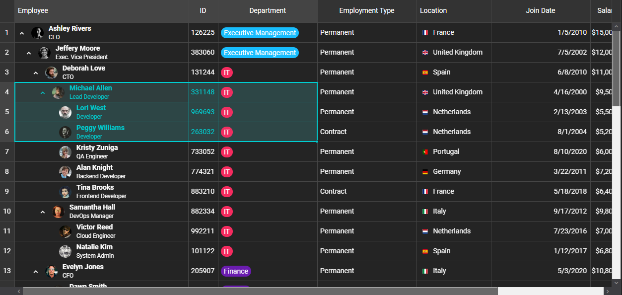
- 📊 Data Grid & TreeGrid – Excel-like features (sorting, filtering, grouping, pivoting, spreadsheet-style editing, AI filtering, and more).
- 📆 Scheduler & Gantt Chart – Full project and resource scheduling with timeline, calendar, and critical path support.
- 🗂️ Docking Layout – Build dynamic dashboards with drag-and-drop panels.
- 📝 Editor – Rich text editing with custom CSS support.
- 🃏 CardView, Kanban, Charts, Tabs, Accordion, Menu, and dozens more.
- 🌍 20+ Localizations included in the library for global apps.
- ⚡ Framework Agnostic – Works with your stack of choice: Angular, React, Vue, Blazor, or plain JavaScript.
Install from npm:
# JavaScript
npm install smart-webcomponents

# Angular
npm install @smart-webcomponents-angular/grid

# React
npm install smart-webcomponents-react

# Vue
npm install smart-webcomponents<!DOCTYPE html>
<html>
<head>
<link rel="stylesheet" type="text/css" href="smart-webcomponents/source/styles/smart.default.css" />
<script type="module">
import 'smart-webcomponents/source/modules/smart.grid.js';
window.onload = function() {
const grid = document.querySelector('smart-grid');
grid.dataSource = [
{ id: 1, product: 'Laptop', price: 1200 },
{ id: 2, product: 'Phone', price: 800 }
];
grid.columns = [
{ label: 'ID', dataField: 'id', width: 50 },
{ label: 'Product', dataField: 'product' },
{ label: 'Price', dataField: 'price', cellsFormat: 'c2' }
];
};
</script>
</head>
<body>
<smart-grid id="grid"></smart-grid>
</body>
</html>// app.component.ts
import { Component, ViewChild, AfterViewInit, ViewEncapsulation } from '@angular/core';
import { GridComponent, GridColumn, DataAdapter, Smart } from 'smart-webcomponents-angular/grid';
import { CommonModule } from '@angular/common';
import { RouterOutlet } from '@angular/router';
import { GridModule } from 'smart-webcomponents-angular/grid';
@Component({
selector: 'app-root',
standalone: true,
imports: [CommonModule, GridModule, RouterOutlet],
template: '<smart-grid [dataSource]="dataSource" [columns]="columns" #grid></smart-grid>',
styleUrls: ['app.component.css'],
encapsulation: ViewEncapsulation.None
})
export class AppComponent implements AfterViewInit {
@ViewChild("grid", { read: GridComponent, static: false }) grid!: GridComponent;
dataSource: any[] = [
{ "firstName": "Beate", "lastName": "Wilson", "productName": "Caramel Latte"},
{ "firstName": "Ian", "lastName": "Nodier", "productName": "Caramel Latte"},
{ "firstName": "Petra", "lastName": "Vileid", "productName": "Green Tea"},
{ "firstName": "Mayumi", "lastName": "Ohno", "productName": "Caramel Latte"},
{ "firstName": "Mayumi", "lastName": "Saylor", "productName": "Espresso con Panna"},
{ "firstName": "Regina", "lastName": "Fuller", "productName": "Caffe Americano" },
{ "firstName": "Regina", "lastName": "Burke", "productName": "Caramel Latte"},
{ "firstName": "Andrew", "lastName": "Petersen", "productName": "Caffe Americano"},
{ "firstName": "Martin", "lastName": "Ohno", "productName": "Espresso con Panna"},
{ "firstName": "Beate", "lastName": "Devling", "productName": "Green Tea"},
{ "firstName": "Sven", "lastName": "Devling", "productName": "Espresso Truffle"},
{ "firstName": "Petra", "lastName": "Burke", "productName": "Peppermint Mocha Twist"},
{ "firstName": "Marco", "lastName": "Johnes", "productName": "Caffe Mocha"}
]
columns: GridColumn[] = [{
label: 'First Name',
dataField: 'firstName'
},
{
label: 'Last Name',
dataField: 'lastName'
},
{
label: 'Product',
dataField: 'productName'
}
];
ngAfterViewInit(): void {
}
}import 'smart-webcomponents-react/source/styles/smart.default.css';
import { Smart, Grid } from 'smart-webcomponents-react/grid';
function App() {
const behavior = {
columnResizeMode: 'growAndShrink'
}
const appearance = {
alternationCount: 2,
showRowHeader: true,
showRowHeaderSelectIcon: true,
showRowHeaderFocusIcon: true
}
const paging = {
enabled: true
}
const pager = {
visible: true
}
const sorting = {
enabled: true
}
const editing = {
enabled: true
}
const selection = {
enabled: true,
allowCellSelection: true,
allowRowHeaderSelection: true,
allowColumnHeaderSelection: true,
mode: 'extended'
}
const dataSourceSettings = {
dataFields: [
'firstName: string',
'lastName: string',
'productName: string'
]
}
const dataSource = [
{ "firstName": "Beate", "lastName": "Wilson", "productName": "Caramel Latte"},
{ "firstName": "Ian", "lastName": "Nodier", "productName": "Caramel Latte"},
{ "firstName": "Petra", "lastName": "Vileid", "productName": "Green Tea"},
{ "firstName": "Mayumi", "lastName": "Ohno", "productName": "Caramel Latte"},
{ "firstName": "Mayumi", "lastName": "Saylor", "productName": "Espresso con Panna"},
{ "firstName": "Regina", "lastName": "Fuller", "productName": "Caffe Americano" },
{ "firstName": "Regina", "lastName": "Burke", "productName": "Caramel Latte"},
{ "firstName": "Andrew", "lastName": "Petersen", "productName": "Caffe Americano"},
{ "firstName": "Martin", "lastName": "Ohno", "productName": "Espresso con Panna"},
{ "firstName": "Beate", "lastName": "Devling", "productName": "Green Tea"},
{ "firstName": "Sven", "lastName": "Devling", "productName": "Espresso Truffle"},
{ "firstName": "Petra", "lastName": "Burke", "productName": "Peppermint Mocha Twist"},
{ "firstName": "Marco", "lastName": "Johnes", "productName": "Caffe Mocha"}
]
const columns = [{
label: 'First Name',
dataField: 'firstName'
},
{
label: 'Last Name',
dataField: 'lastName'
},
{
label: 'Product',
dataField: 'productName'
}
]
return (
<div>
<Grid
dataSourceSettings={dataSourceSettings}
dataSource={dataSource}
columns={columns}
appearance={appearance}
behavior={behavior}
selection={selection}
paging={paging}
pager={pager}
sorting={sorting}
editing={editing}
>
</Grid>
</div>
);
}
export default App;<template>
<div class="vue-root">
<div class="demo-description">
The Grid in this demo displays data in a series of rows and columns. This
is the simplest case when the Grid is bound to a local data source.
</div>
<smart-grid id="grid"></smart-grid>
</div>
</template>
<script>
import { onMounted } from "vue";
import "smart-webcomponents/source/styles/smart.default.css";
import "smart-webcomponents/source/modules/smart.grid.js";
export default {
name: "app",
setup() {
onMounted(() => {
window.Smart(
"#grid",
class {
get properties() {
return {
behavior: {
columnResizeMode: "growAndShrink"
},
appearance: {
alternationCount: 2,
showRowHeader: true,
showRowHeaderSelectIcon: true,
showRowHeaderFocusIcon: true
},
paging: {
enabled: true
},
pager: {
visible: true
},
sorting: {
enabled: true
},
editing: {
enabled: true
},
selection: {
enabled: true,
allowCellSelection: true,
allowRowHeaderSelection: true,
allowColumnHeaderSelection: true,
mode: "extended"
},
dataSource: [
{ "firstName": "Beate", "lastName": "Wilson", "productName": "Caramel Latte"},
{ "firstName": "Ian", "lastName": "Nodier", "productName": "Caramel Latte"},
{ "firstName": "Petra", "lastName": "Vileid", "productName": "Green Tea"},
{ "firstName": "Mayumi", "lastName": "Ohno", "productName": "Caramel Latte"},
{ "firstName": "Mayumi", "lastName": "Saylor", "productName": "Espresso con Panna"},
{ "firstName": "Regina", "lastName": "Fuller", "productName": "Caffe Americano" },
{ "firstName": "Regina", "lastName": "Burke", "productName": "Caramel Latte"},
{ "firstName": "Andrew", "lastName": "Petersen", "productName": "Caffe Americano"},
{ "firstName": "Martin", "lastName": "Ohno", "productName": "Espresso con Panna"},
{ "firstName": "Beate", "lastName": "Devling", "productName": "Green Tea"},
{ "firstName": "Sven", "lastName": "Devling", "productName": "Espresso Truffle"},
{ "firstName": "Petra", "lastName": "Burke", "productName": "Peppermint Mocha Twist"},
{ "firstName": "Marco", "lastName": "Johnes", "productName": "Caffe Mocha"}
],
columns: [
{
label: "First Name",
dataField: "firstName"
},
{
label: "Last Name",
dataField: "lastName"
},
{
label: "Product",
dataField: "productName"
}
]
};
}
}
);
});
}
};
</script>
<style>
body {
min-height: 700px;
}
smart-grid {
width: 100%;
height: auto;
}
</style>@page "/grid-example"
@using Smart.Blazor
<Grid DataSource="dataSource" Columns="columns"></Grid>
@code {
public object[] dataSource = new object[]
{
new { id = 1, product = "Laptop", price = 1200 },
new { id = 2, product = "Phone", price = 800 }
};
public object[] columns = new object[]
{
new { label = "ID", dataField = "id", width = 50 },
new { label = "Product", dataField = "product" },
new { label = "Price", dataField = "price", cellsFormat = "c2" }
};
}- 🌍 Localizations for all components (20 languages).
- 📈 Gantt Chart Critical Path.
- 📝 Grid Spreadsheet Extensions (bold, italic, underline, strikethrough, colors).
- 🔄 Grid Transpose & AI Filtering.
- 📱 Number pad input editor for mobile devices.
We welcome feedback, issues, and pull requests!
Open to bug reports, documentation fixes, demo contributions
Please see our contribution guidelines.
This project is licensed under the Commercial License.
See LICENSE for more information.
- 🌍 Website
- 📚 Documentation
- 🎮 Live Demos
- 📰 Changelog
💡 Smart Web Components help you build applications that look modern, feel responsive, and scale with your needs.
![@dependabot[bot]](https://avatars.githubusercontent.com/in/29110?s=64&v=4)